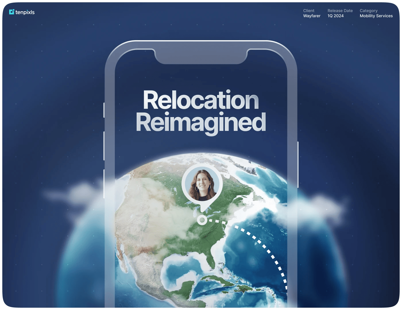
The Client
Wayfarer is a top-tier relocation management company, coordinating comprehensive global and domestic employee moves, ensuring seamless transitions with advanced technology solutions.
Challenges
Modernize the digital interfaces to rectify usability concerns, which then improves user engagement and stays ahead of competitors.
1
Reduce navigational complexity
2
Improve engagement and feature adoption
3
Elevate user experience to outperform competitors
Approach
We focused on using an iterative approach through user feedback to make data-based decisions. We also used extensive competitive research to find areas where we could improve and outperform competitors.
Outcome
70%+ Usability Success Rate, implementation of innovative features outpacing competitors, and improved user operational efficiency.
User Needs
tenpixls embarked on a rigorous research phase, employing competitor analysis, user testimonials, and direct feedback to grasp a nuanced understanding of Wayfarer's users—from relocation specialists to HR managers and the transferees.
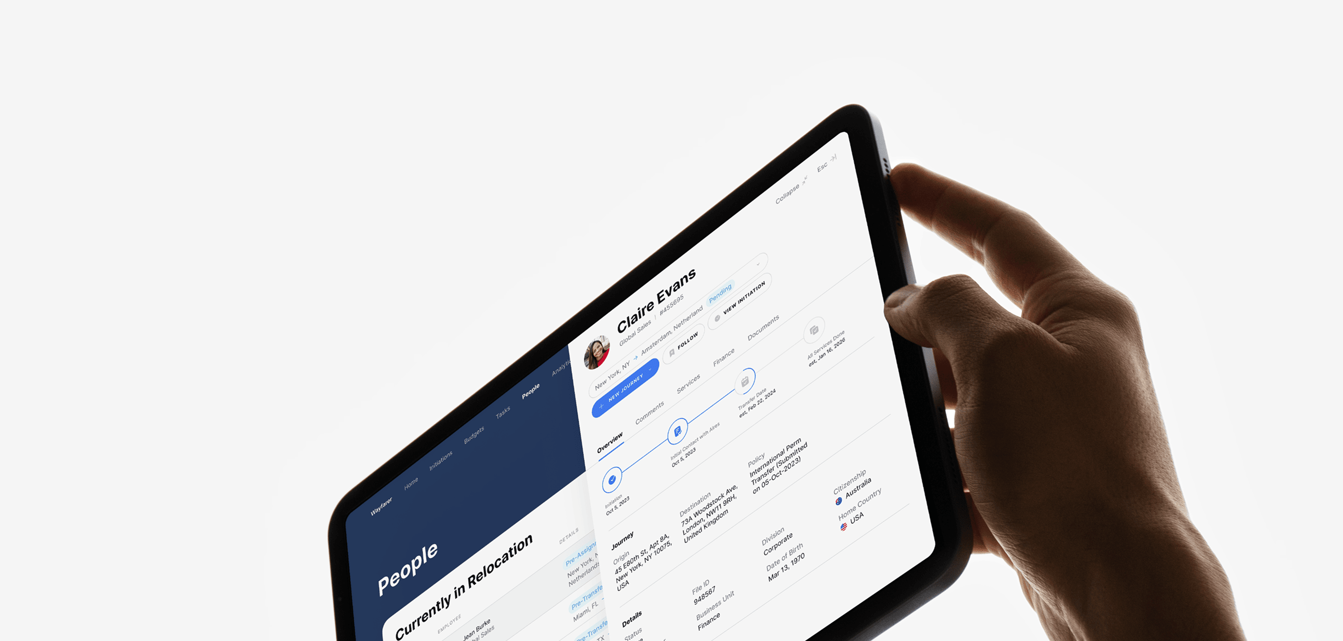
Wireframing
With a solid grasp of user needs, we developed a wireframing strategy that acted as the blueprint for the redesigned interfaces. This phase was crucial in visualizing the new flow and functionality, ensuring a user-centric design that was both innovative and practical.
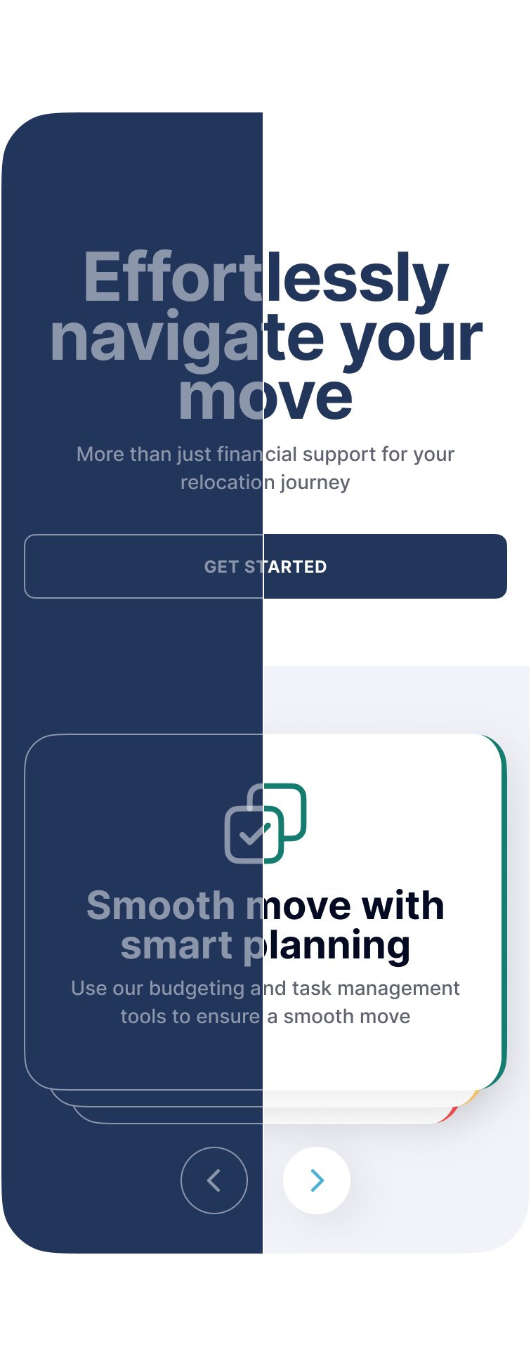
Improving Engagement
Recognizing the stress and confusion often faced by first-time transferees, we focused on improving user engagement rates. Our strategy involved several key improvements:
① Clear and informative onboarding
② Refined Navigation Structure
The old way of navigating Wayfarer's platform was like getting lost in a maze. We completely revamped the system to make it much simpler and faster to find what you need.
Data Shortcuts
These function as mini gateways, offering users quick previews of information from various sections. This approach reduces the need for deep navigation dives and enhances overall user accessibility.
Pass-Through Navigation
This is a smarter setup where each menu item acts like a full info pack. Users get a full picture, making it easier to see how everything connects. It mixes a clean menu with the freedom to jump to any info they need without losing track.
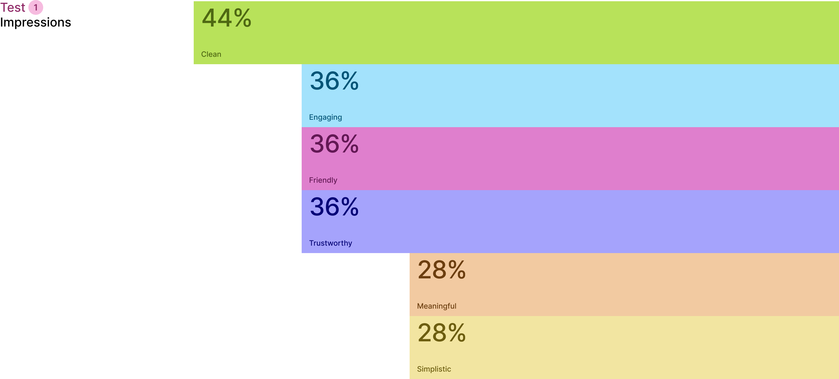
Verifying Hypotheses
In our commitment to data-driven development, we prioritized validation over speculation. An iterative process involving real-user feedback was employed twice. First, to validate wireframes. Second, to refine the UI designs.
Values
The final designs reflected Aires' core values of empowerment, respect, passion, accountability, teaching, honesty, human touch and a ‘Yes We Can’ attitude.

Accessibility
A dedicated effort was made to ensure WCAG compliance. This made Wayfarer's platform accessible to all users and highlighted their commitment to inclusivity.
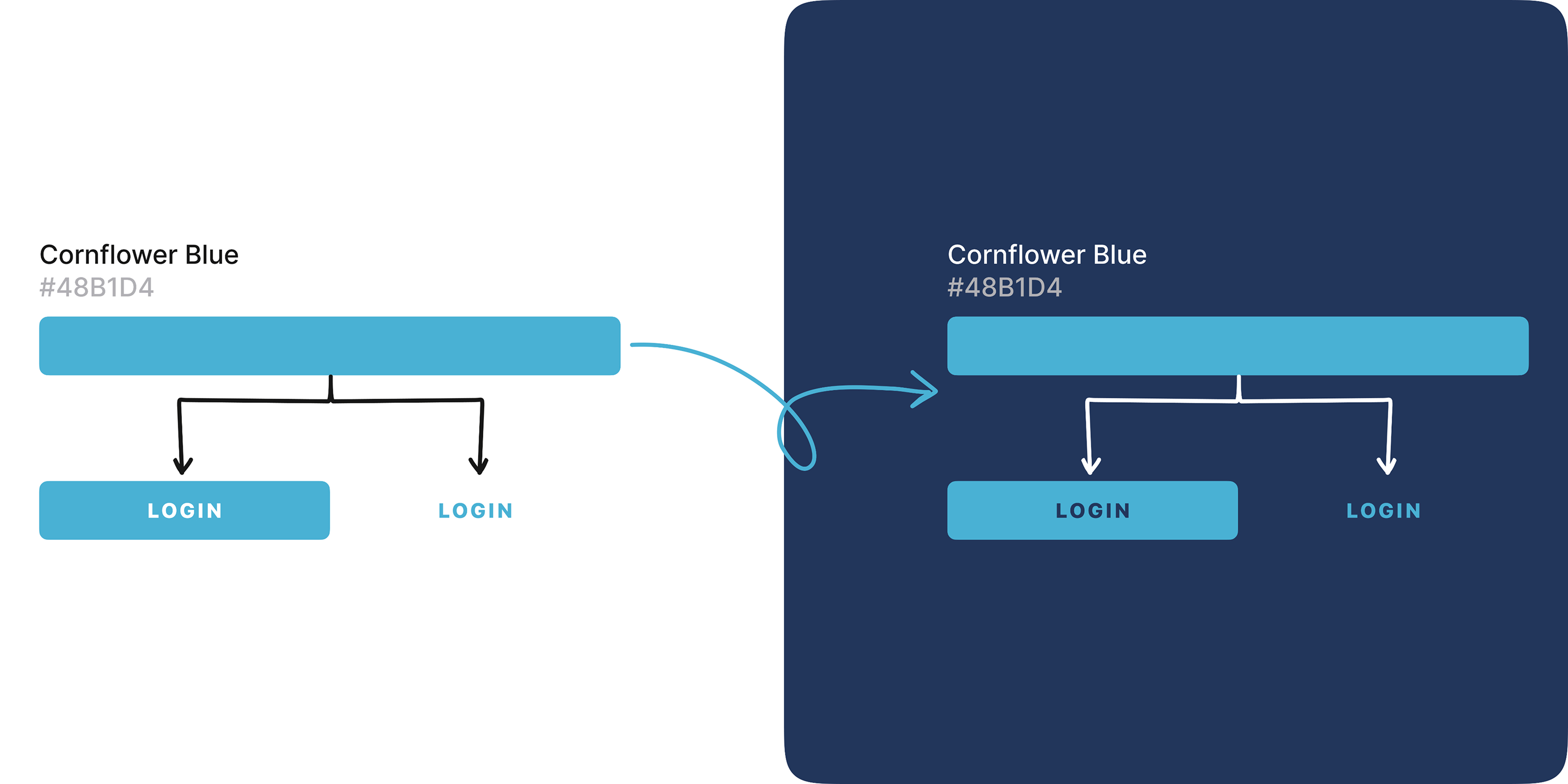
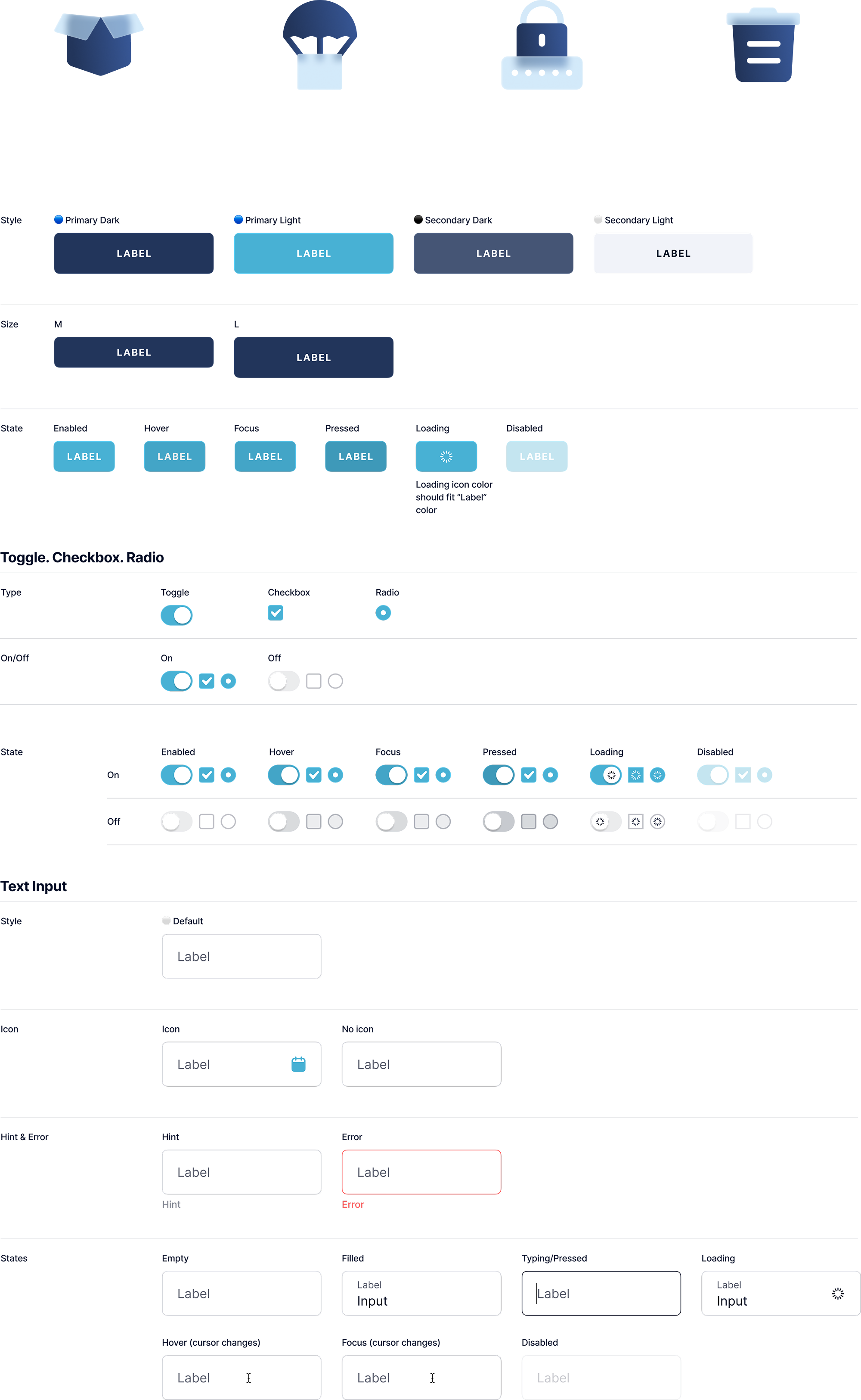
Design System
The project also involved a strategic evaluation of Wayfarer's brand positioning. This lead to subtle, yet impactful changes that retained core brand elements, while refreshing the visual and communicative style to resonate with the new user experience goals.
Results & Impact
Our work with Wayfarer completely transformed their core products. Here's what we achieved:
70% Usability
Success Rate
Our analysis and testing identified and confirmed the best solutions for meeting Wayfarer's objectives.
Innovative
Features
We helped Wayfarer add innovative features that put them ahead of the competition.
Brand
Makeover
We also gave Wayfarer's brand a makeover, setting them up for the big changes they were aiming for.
Team
Guidance
We trained the Wayfarer's team on how to use the new design principles so they can build great products.
Testing
Results
We provided Wayfarer with valuable user feedback, helping them understand their audience better.